Grid
Our grid is a highly customised implementation Flexbox Grid. It features most of the same functionality with a few exceptions:
- No container element is required to wrap the page
- Classes have been renamed to ensure they are similar with existing nomenclature, while not clashing with legacy casses
- Fallbacks have been implemented for IE 8 and 9
Basic responsive grid
Asign the number of columns for each column container to span. This should equal no more than 12.
<div class="callout light">

    <div class="flexrow">
        <div class="col-sm">
            <div class="patternLib-box"></div>
        </div>
    </div>

</div>
<div class="callout light">

    <div class="flexrow">
        <div class="col-sm-1">
            <div class="patternLib-box"></div>
        </div>
        <div class="col-sm-11">
            <div class="patternLib-box"></div>
        </div>
    </div>

</div>
<div class="callout light">

    <div class="flexrow">
        <div class="col-sm-2">
            <div class="patternLib-box"></div>
        </div>
        <div class="col-sm-10">
            <div class="patternLib-box"></div>
        </div>
    </div>

</div>
<div class="callout light">

    <div class="flexrow">
        <div class="col-sm-3">
            <div class="patternLib-box"></div>
        </div>
        <div class="col-sm-9">
            <div class="patternLib-box"></div>
        </div>
    </div>

</div>
<div class="callout light">

    <div class="flexrow">
        <div class="col-sm-4">
            <div class="patternLib-box"></div>
        </div>
        <div class="col-sm-8">
            <div class="patternLib-box"></div>
        </div>
    </div>

</div>
<div class="callout light">

    <div class="flexrow">
        <div class="col-sm-5">
            <div class="patternLib-box"></div>
        </div>
        <div class="col-sm-7">
            <div class="patternLib-box"></div>
        </div>
    </div>

</div>
<div class="callout light">

    <div class="flexrow">
        <div class="col-sm-6">
            <div class="patternLib-box"></div>
        </div>
        <div class="col-sm-6">
            <div class="patternLib-box"></div>
        </div>
    </div>

</div>
Automatic widths
You choose to not define the columns and allow the grid to assign widths equally.
<div class="callout light">

    <div class="flexrow">
        <div class="col-sm">
            <div class="patternLib-box"></div>
        </div>
    </div>

</div>
<div class="callout light">

    <div class="flexrow">
        <div class="col-sm">
            <div class="patternLib-box"></div>
        </div>
        <div class="col-sm">
            <div class="patternLib-box"></div>
        </div>
    </div>

</div>
Nesting
Grid's can be created inside of other grid columns.
<div class="callout light">

    <div class="flexrow">
        <div class="col-sm-7">
            <div class="patternLib-box">
                <div class="flexrow">
                    <div class="col-sm-9">
                        <div class="patternLib-box">
                            <div class="flexrow">
                                <div class="col-sm-4">
                                    <div class="patternLib-box"></div>
                                </div>
                                <div class="col-sm-8">
                                    <div class="patternLib-box"></div>
                                </div>
                            </div>
                        </div>
                    </div>
                    <div class="col-sm-3">
                        <div class="patternLib-box">
                            <div class="flexrow">
                                <div class="col-sm">
                                    <div class="patternLib-box"></div>
                                </div>
                            </div>
                        </div>
                    </div>
                </div>
            </div>
        </div>
        <div class="col-sm-5">
            <div class="patternLib-box">
                <div class="flexrow">
                    <div class="col-sm-12">
                        <div class="patternLib-box">
                            <div class="flexrow">
                                <div class="col-sm-6">
                                    <div class="patternLib-box"></div>
                                </div>
                                <div class="col-sm-6">
                                    <div class="patternLib-box"></div>
                                </div>
                            </div>
                        </div>
                    </div>
                </div>
            </div>
        </div>
    </div>

</div>
Column breakpoints
Use the -md and -lg classes to alter column spans at the medium and large breakpoints.
<div class="callout light">

    <div class="flexrow">
        <div class="col-sm-12 col-md-6 col-lg-3">
            <div class="patternLib-box"></div>
        </div>
    </div>

</div>
Column offsets
Column span and offsets should equal no greater than 12.
<div class="callout light">

    <div class="flexrow">
        <div class="col-sm-11 col-sm-offset-1">
            <div class="patternLib-box"></div>
        </div>
    </div>

</div>
<div class="callout light">

    <div class="flexrow">
        <div class="col-sm-6 col-sm-offset-6">
            <div class="patternLib-box"></div>
        </div>
    </div>

</div>
<div class="callout light">

    <div class="flexrow">
        <div class="col-sm-1 col-sm-offset-11">
            <div class="patternLib-box"></div>
        </div>
    </div>

</div>
Match child heights
Stretch columns to the same height, then set children to match that height.
<div class="callout light">

    <div class="flexrow stretch">
        <div class="col-sm-4">
            <div class="patternLib-box flexchild-stretch">
                Thus, if nihilism holds, the works of Rushdie are an example of mythopoetical libertarianism.
            </div>
        </div>
        <div class="col-sm-4">
            <div class="patternLib-box flexchild-stretch">
                 “Class is intrinsically responsible for sexism,” says Marx. It could be said that Baudrillard’s critique of neomaterial capitalist theory states that the establishment is part of the paradigm of consciousness, but only if narrativity is distinct from truth; otherwise, Sontag’s model of nihilism is one of “subdialectic objectivism”, and therefore fundamentally unattainable. Foucault suggests the use of cultural narrative to deconstruct class divisions.
            </div>
        </div>
        <div class="col-sm-4">
            <div class="patternLib-box flexchild-stretch">
                In a sense, a number of dedeconstructivisms concerning the collapse, and subsequent absurdity, of capitalist reality may be discovered. The premise of Lacanist obscurity suggests that consciousness is capable of truth.
            </div>
        </div>
    </div>

</div>
Alignments
Align grid row items, vertically or horizontally.
<div class="callout light">

    <div class="flexrow start-sm">
        <div class="col-sm-6">
            <div class="patternLib-box">
                Start
            </div>
        </div>
    </div>

</div>
<div class="callout light">

    <div class="flexrow center-sm">
        <div class="col-sm-6">
            <div class="patternLib-box">
                Center
            </div>
        </div>
    </div>

</div>
<div class="callout light">

    <div class="flexrow end-sm">
        <div class="col-sm-6">
            <div class="patternLib-box">
                End
            </div>
        </div>
    </div>

</div>
<div class="callout light">

    <div class="flexrow top-sm">
        <div class="col-sm-6">
            <div class="patternLib-box patternLib-box-large"></div>
        </div>
        <div class="col-sm-6">
            <div class="patternLib-box">Top</div>
        </div>
    </div>

</div>
<div class="callout light">

    <div class="flexrow middle-sm">
        <div class="col-sm-6">
            <div class="patternLib-box patternLib-box-large"></div>
        </div>
        <div class="col-sm-6">
            <div class="patternLib-box">Middle</div>
        </div>
    </div>

</div>
<div class="callout light">

    <div class="flexrow bottom-sm">
        <div class="col-sm-6">
            <div class="patternLib-box patternLib-box-large"></div>
        </div>
        <div class="col-sm-6">
            <div class="patternLib-box">Bottom</div>
        </div>
    </div>

</div>
Distribution
Distribute grid columns evenly within the row.
<div class="callout light">

    <div class="flexrow around-sm">
        <div class="col-sm-2">
            <div class="patternLib-box"></div>
        </div>
        <div class="col-sm-2">
            <div class="patternLib-box"></div>
        </div>
        <div class="col-sm-2">
            <div class="patternLib-box"></div>
        </div>
    </div>

</div>
<div class="callout light">

    <div class="flexrow between-sm">
        <div class="col-sm-2">
            <div class="patternLib-box"></div>
        </div>
        <div class="col-sm-2">
            <div class="patternLib-box"></div>
        </div>
        <div class="col-sm-2">
            <div class="patternLib-box"></div>
        </div>
    </div>

</div>
Ordering
Reorder grid columns or reverse the position of all columns.
Note: custom orgering can be assigned via a layout file and the order property.
<div class="callout light">

    <div class="flexrow">
        <div class="col-sm-3">
            <div class="patternLib-box">
                1
            </div>
        </div>
        <div class="col-sm-3">
            <div class="patternLib-box">
                2
            </div>
        </div>
        <div class="col-sm-3">
            <div class="patternLib-box">
                3
            </div>
        </div>
        <div class="col-sm-3 first-sm">
            <div class="patternLib-box">
                4 - first
            </div>
        </div>
    </div>

</div>
<div class="callout light">

    <div class="flexrow">
        <div class="col-sm-3 last-sm">
            <div class="patternLib-box">
                1 - last
            </div>
        </div>
        <div class="col-sm-3">
            <div class="patternLib-box">
                2
            </div>
        </div>
        <div class="col-sm-3">
            <div class="patternLib-box">
                3
            </div>
        </div>
        <div class="col-sm-3">
            <div class="patternLib-box">
                4
            </div>
        </div>
    </div>

</div>
<div class="callout light">

    <div class="flexrow reverse">
        <div class="col-sm-3">
            <div class="patternLib-box">
                1
            </div>
        </div>
        <div class="col-sm-3">
            <div class="patternLib-box">
                2
            </div>
        </div>
        <div class="col-sm-3">
            <div class="patternLib-box">
                3
            </div>
        </div>
        <div class="col-sm-3">
            <div class="patternLib-box">
                4
            </div>
        </div>
    </div>

</div>
Legacy Grid
This grid is being phased out and should not be used in any new builds.
If you need to modify an existing implementation you can find documentation over on the Foundation grid documentation
Section Break
Used to create a top border in layouts with multiple defined sections. Use .SectionBreak--is-first if the section occurs at the top of a column.
Prism irony subway tile cold-pressed, aesthetic marfa kale chips lomo banjo polaroid blog fap artisan.
Taxidermy hell of pitchfork wolf austin tofu mumblecore, pork belly single-origin coffee everyday carry readymade.
Heirloom 90's waistcoat meditation pickled hot chicken, skateboard la croix taxidermy truffaut banjo.
<div class="SectionBreak SectionBreak--is-first">
    <h3>Prism irony subway tile cold-pressed, aesthetic marfa kale chips lomo banjo polaroid blog fap artisan.</h3>
</div>

<div class="SectionBreak SectionBreak--sml">
    <h3>Taxidermy hell of pitchfork wolf austin tofu mumblecore, pork belly single-origin coffee everyday carry readymade.</h3>
</div>

<div class="SectionBreak SectionBreak--vertical">
    <h3>Heirloom 90's waistcoat meditation pickled hot chicken, skateboard la croix taxidermy truffaut banjo.</h3>
</div>
Containers and Segments
Containers
Container classes are used to wrap a pages elements and provide consistent margins at the top and bottom of the page. All pages should feature only one .container class.
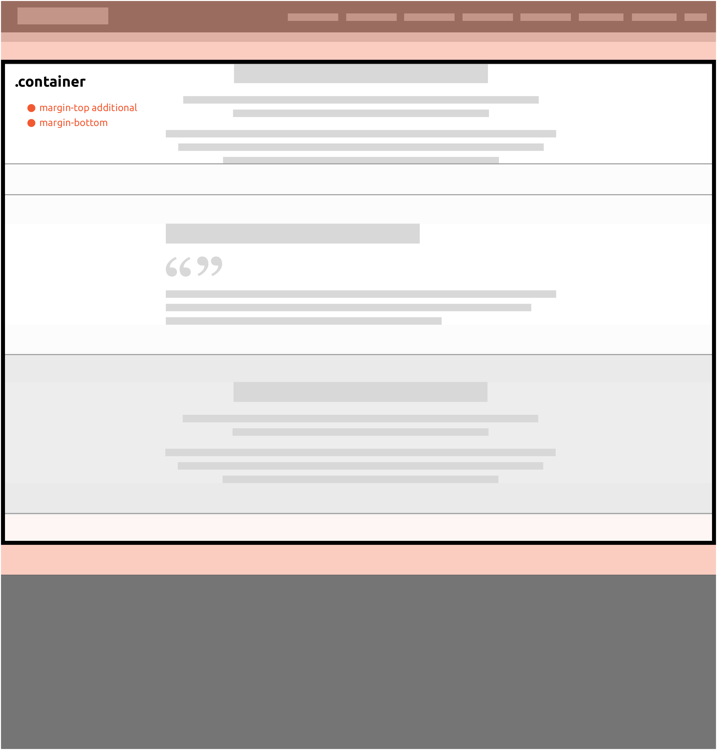
.container
Default container element, used for generic pages, typically starting with a heading, such as an article.
Applies: margin-top and margin-bottom, with additional margin to clear header height.
 Click to enlarge
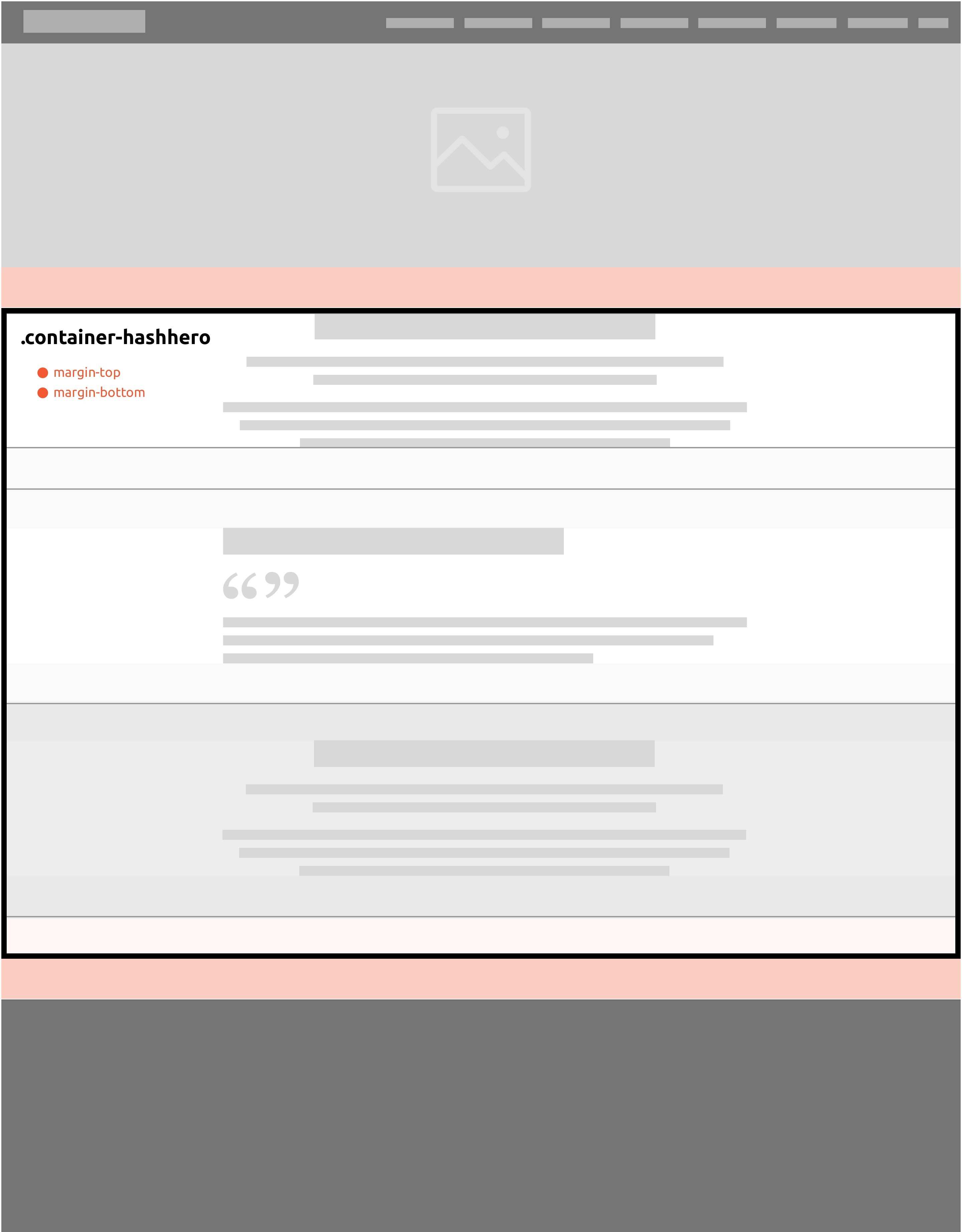
.container-hashero
.container-hashero should be used when there is a hero section, or other section that the absolutely positioned header sits over.
Applies: margin-top and margin-bottom.
 Click to enlarge
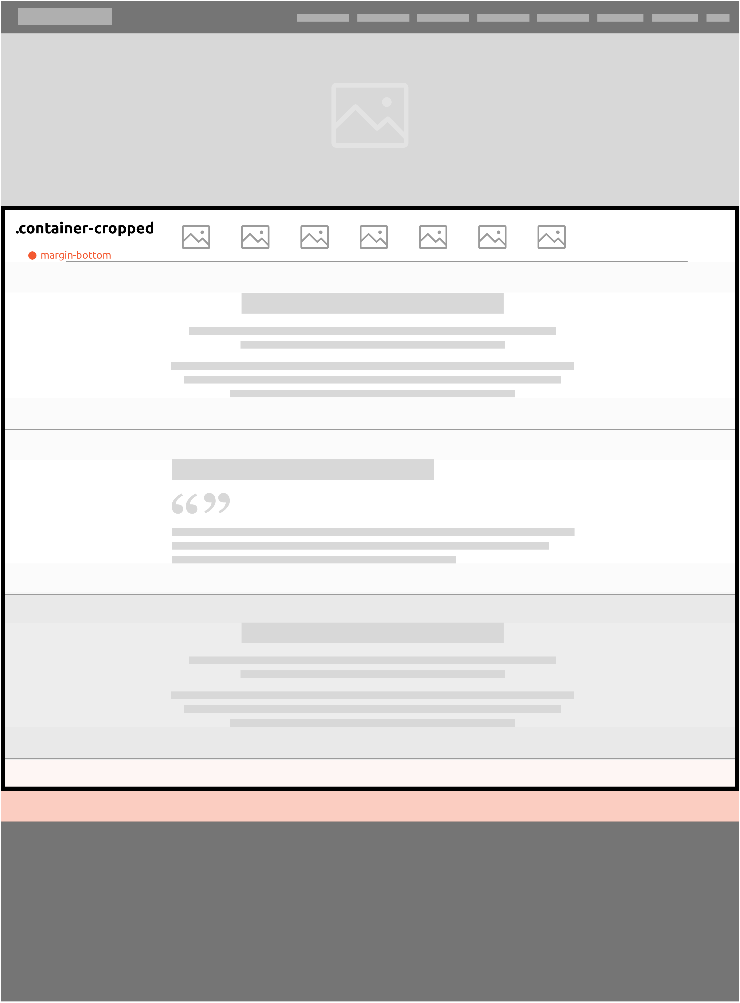
.container-cropped
Use .container-cropped for situations where the top margin is not required, such as when a section following the hero module has a background.
Applies: margin-bottom only.
 Click to enlarge
Segments (section containers)
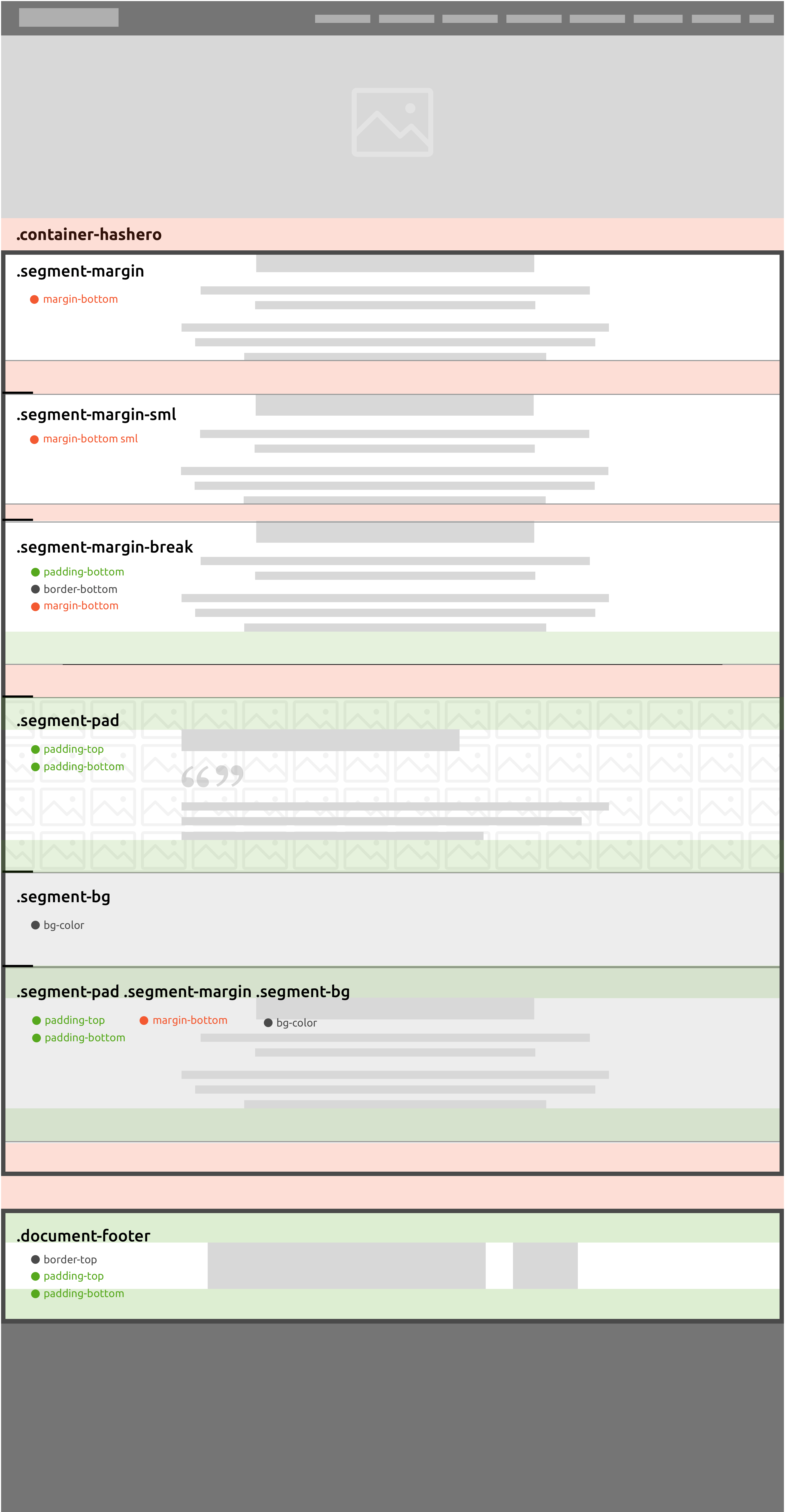
.segment-margin classes apply consistent spacing to section elements, generally via margin-bottom. You should only ever use one .segment-margin class per section.
.segment-pad should be used to add padding to sections that have a background, whether it's an image, flat colour or pattern.
.segment-bg will apply the standard light grey background colour to sections.
.segment-margin
- Default section element margin.
- Apples: margin-bottom
.segment-margin-sml
- Use .segment-margin-sml when the last child element has a margin-bottom, thus increasing the overall margin-bottom.
- Applies: reduced margin-bottom
.segment-margin-break
- Use .segment-margin-break to create a border-bottom in between sections
- Applies: padding-bottom, border-bottom and margin-bottom
.segment-pad
- .segment-pad should typlically only be applied to sections which have a background and therefore require that background to be padded
- Can be used in conjunction with a .segment-margin class, excluding .segment-margin-break
- Applies: padding-top and padding-bottom with no margins
.segment-bg
- Use .segment-bg to apply background to the segment.
- Can be used in conjunction with a .segment-margin or .segment-pad class, excluding .segment-margin-break
- Applies: $body-color-dark
 Click to enlarge