Article Author
The Article Author module should be appended a CMS article, not the start of it. It should additionarlly occur before comments if the Comments module is in use.
Note: this needs to be deprecated in favour of the Author module.
<div class="ArticleAuthor">
    By <a href="/travel-safety/author/Phil-Sylvester" rel="author">Phil Sylvester</a>,
    <div class="ArticleAuthor-meta">
       Travel Insights Editor - 11/6/2015 9:37 AM - <span class="viewcount">1 Views</span>
    </div>
</div>
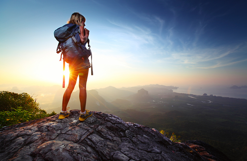
Article Image
Symantically correct markup for images and captions. Images with captions that follow this markup within a CMS article will be styled automatically for users.
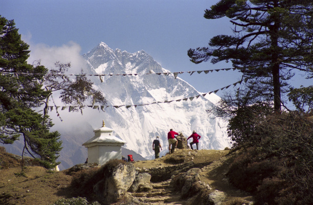
This is an example text before the captioned image.
This is an example text after the captioned image.
This is an example text after the non-captioned image.
<div class="cmsArticle-content">
    <p>This is an example text before the captioned image.</p>
    <figure>
        <img src="https://d2ty3p0lzh1wfl.cloudfront.net/safetyhub_images/Nepal/nepal%20view%20wide.jpg" />
        <figcaption>This is a caption - Mumblecore you probably haven't heard of them forage, lumbersexual occupy pinterest williamsburg pop-up vice paleo swag schlitz banjo gentrify. Scenester post-ironic forage, roof party swag pug slow-carb offal.</figcaption>
    </figure>
    <p>This is an example text after the captioned image.</p>
    <p><img src="https://d2ty3p0lzh1wfl.cloudfront.net/safetyhub_images/Nepal/nepal%20view%20wide.jpg" /></p>
    <p>This is an example text after the non-captioned image.</p>
</div>
Author
The Author module details the author of any content, whether it be an article, testimonial, etc. An Author can have an Author Title or an Author Excerpt, which render differently based on what type it .s

Christian's Story
World Nomads Travel Photography Scholarships Mentor
Travel Safety Author
Lorem ipsum dolor sit amet, consectetur adipiscing elit. Pellentesque maximum nibh a ullamcorper aliquet. Read more stories by Kesha.
Lorem ipsum dolor sit amet, consectetur adipiscing elit. Pellentesque maximum nibh a ullamcorper aliquet. Read more stories by Kesha.
Community Contributer
<div class="Author Author--centered">
    <picture class="Avatar">
        <source srcset="https://cdn.worldnomads.net/Media/Default/LearnImages/photo2016/wn-prfl-richard.jpg"/>
        <img src="https://cdn.worldnomads.net/Media/Default/LearnImages/photo2016/wn-prfl-richard.jpg" alt="Richard's Profile Image"/>
    </picture>
    <div class="Author-profile">
        <h4>Christian's Story</h4>
        <small class="Author-title">World Nomads Travel Photography Scholarships Mentor</small>
    </div>
</div>

<div class="Author">
    <picture class="Avatar Avatar--sml">
        <source srcset="img/article-author.jpg"/>
        <img src="img/article-author.jpg" alt="Author's Avatar">
    </picture>
    <div class="Author-profile">
        <strong>Steve Jones,</strong><br><small class="Author-title">Travel Safety Author</small>
    </div>
</div>

<div class="Author">
    <picture class="Avatar Avatar--sml">
        <source srcset="img/article-author.jpg"/>
        <img src="img/article-author.jpg" alt="Author's Avatar">
    </picture>
    <div class="Author-profile">
        <strong class="CopyBreak">Steve Jones,</strong>
        <p>Lorem ipsum dolor sit amet, consectetur adipiscing elit. Pellentesque maximum nibh a ullamcorper aliquet. <a href="#">Read more stories by Kesha</a>.</p>
    </div>
</div>

<div class="Author">
    <picture class="Avatar Avatar--sml">
        <source srcset="img/article-author.jpg"/>
        <img src="img/article-author.jpg" alt="Author's Avatar">
    </picture>
    <div class="Author-profile">
        <strong>Steve Jones,</strong>
        <small class="Author-title CopyBreak CopyBreak--leftAlign">Travel Safety Author</small>
        <p>Lorem ipsum dolor sit amet, consectetur adipiscing elit. Pellentesque maximum nibh a ullamcorper aliquet. <a href="#">Read more stories by Kesha</a>.</p>
    </div>
</div>

<div class="patternLib-author callout reverse">

    <div class="Author Author--reverse">
        <picture class="Avatar Avatar--sml">
            <source srcset="img/article-author.jpg"/>
            <img src="img/article-author.jpg" alt="Author's Avatar">
        </picture>
        <div class="Author-profile">
            <strong>Some Guy,</strong><br><small class="Author-title">Community Contributer</small>
        </div>
    </div>

</div>
Avatar
The Avatar module is a module for displaying a user profile picture.
<picture class="Avatar Avatar--sml">
    <source srcset="img/article-author.jpg"/>
    <img src="img/article-author.jpg" alt="Author's Avatar">
</picture>

<picture class="Avatar">
    <source srcset="img/article-author.jpg"/>
    <img src="https://cdn.worldnomads.net/Media/Default/LearnImages/photo2016/wn-prfl-richard.jpg" alt="Richard's Profile Image"/>
</picture>

<picture class="Avatar Avatar--lge">
    <source srcset="https://cdn.worldnomads.net/Media/Default/LearnImages/photo2016/wn-prfl-richard.jpg"/>
    <img src="https://cdn.worldnomads.net/Media/Default/LearnImages/photo2016/wn-prfl-richard.jpg" alt="Richard's Profile Image"/>
</picture>

<picture class="Avatar Avatar--xlge">
    <source srcset="https://cdn.worldnomads.net/Media/Default/LearnImages/photo2016/wn-prfl-richard.jpg"/>
    <img src="https://cdn.worldnomads.net/Media/Default/LearnImages/photo2016/wn-prfl-richard.jpg" alt="Richard's Profile Image"/>
</picture>

<div class="Avatar Avatar--sml" style="background-image: url(img/article-author.jpg)" title="Author's Avatar"></div>
The Avatar--funding sub-module is for positioning funding indicators as well as showing funding amounts on hover.
Note: The SVG supplied can be copied and used, it has been sized so the stroke-dashoffset represents the unfunded percentage, in the example it has 25% funding so the stroke-dashoffset is 75 (100 - 25).
<a href="#" class="Avatar Avatar--funding">
    <svg class="Avatar-fundingIndicator" viewBox="-20 -20 40 40">
        <circle cx="0" cy="0" fill="transparent" r="15.915" stroke="#000" stroke-dasharray="100" stroke-width="32" transform="rotate(-90)" stroke-dashoffset="75"></circle>
    </svg>
    <div class="Avatar Avatar--lge">
        <div class="Avatar-fundingOverlay">
            25%
            <small>funded</small>
        </div>
        <picture>
            <source srcset="https://cdn.worldnomads.net/Media/Default/LearnImages/photo2016/wn-prfl-richard.jpg"/>
            <img src="https://cdn.worldnomads.net/Media/Default/LearnImages/photo2016/wn-prfl-richard.jpg" alt="Richard's Profile Image"/>
        </picture>
    </div>
</a>
Blockquote
The Blockquote module should be used to highlight a specific quote, typically from the article author. Suggested use is for retweeting or other high level calls to action.
It is advised not to use more than one Blockquote module in an article.
It's pretty straightforward; no valid license in the country where the accident happened, means you're riding illegally and you're not covered.
<blockquote class="Blockquote">
    It's pretty straightforward; no valid license in the country where the accident happened, means you're riding illegally and you're not covered.
</blockquote>
Brightcove Custom
The Brightcove custom player module can only be used with the Brightcove video player, this module overrides the default Brightcove styling.
<video-js
    data-account="5486793334001"
    data-video-id="5809649721001"
    data-player="EHOp8FQBK5"
    data-embed="default"
    controls
    data-application-id
    class="vjs vjs-fluid"
>
</video-js>

<video
    data-playlist-id="6033513092001"
    data-account="5486793334001"
    data-player="zFA6yZIBx"
    data-embed="default"
    data-application-id
    class="video-js vjs vjs-fluid"
    controls
></video>
<div class="vjs-playlist"></div>

<script src="//players.brightcove.net/5486793334001/EHOp8FQBK5_default/index.min.js"></script>
<script src="//players.brightcove.net/5486793334001/zFA6yZIBx_default/index.min.js"></script>
Code
The Code module is used to style simple blocks of code. Note: this is not a syntax highlighter.
function code_demo(this) {
    this = true;
    console.log(true);
}
<code class="Code">
function code_demo(this) {
    this = true;
    console.log(true);
}
</code>

<textarea class="Code">
h1 {
    color: blue;
    background-color: yellow;
    border: 1px solid black;
}
</textarea>
Comments
The Comments module should be used at the of CMS articles or pages with commenting enabled.
<aside class="Comments">
    <h4><span class="Icon Icon-sml icon-wn-bubbles"></span> 25 Comments</h4>
    <ul class="Comments-list">
        <li>
            <small><strong>stevesmith said</strong> 8 months ago</small>
            <p>I've been to this place. It was real good and I made heaps of friends. They weren't real but they were friends nontheless.</p>
            <ul class="Comments-list">
                <li>
                    <small><strong>stevesmith said</strong> 8 months ago</small>
                    <p>I've been to this place. It was real good and I made heaps of friends. They weren't real but they were friends nontheless.</p>
                </li>
            </ul>
        </li>
    </ul>
</aside>
Content Card
The Content Card module is used to provide a summarised reference to content, typically as an anchor tag to the full content. Widths should ideally be defined by the grid and not as custom layouts.
It's worth noting that all content elements (copy, image, meta data, country), of the card are optional, with the exception of the heading.
Base Content Cards
Basic Content Card
Therefore, if dialectic capitalism holds, the works of Pynchon are postmodern. Many deappropriations concerning postdialectic patriarchialism exist.

<div class="patternLib-contentcard">

    <div class="ContentCard">
        <div class="ContentCard-content">
            <h4 class="ContentCard-title">Basic Content Card</h4>
            <p class="ContentCard-copy">Therefore, if dialectic capitalism holds, the works of Pynchon are postmodern. Many deappropriations concerning postdialectic patriarchialism exist.</p>
            <button class="button alt-dark small">Click this</button>
        </div>
    </div>

</div>
<div class="patternLib-contentcard">
    <div class="ContentCard ContentCard--articleBasic">
        <a href="#" class="ContentCard-content">
            <span class="ContentCard-label">Buy INSURANCE</span>
            <h3 class="ContentCard-title">Basic Content Card with no image</h3>
        </a>
    </div>
</div>
<div class="patternLib-contentcard">

    <a href="" class="ContentCard">
        <div class="ContentCard-media">
            <img src="img/contentcard-hiking.jpg" alt="People avoiding an ambush" />
        </div>
        <div class="ContentCard-content">
            <h4 class="ContentCard-title">Content Card as an anchor</h4>
        </div>
    </a>

</div>
<div class="patternLib-contentcard">

    <a href="" class="ContentCard">
        <div class="ContentCard-media">
            <img src="img/contentcard-pickpocket.jpg" alt="Person returning someones wallet" />
            <span class="ContentCard-badge Badge Badge--sml">
                <span class="Badge-label">2017</span>
                <span class="Badge-icon icon-wn-lightbulb"></span>
            </span>
        </div>
        <div class="ContentCard-content">
            <span class="ContentCard-label">Germany</span>
            <h4 class="ContentCard-title">Content Card featuring all sub-components</h4>
            <p class="ContentCard-copy">If Baudrillardist hyperreality holds, we have to choose between materialist narrative and pretextual feminism.</p>
        </div>
        <div class="ContentCard-footer">
            <span class="ContentCard-meta">28 Mar. 2017 | Raoul Duke</span>
        </div>
    </a>

</div>
<div class="callout light">
    <div class="patternLib-contentcard">

        <a href="" class="ContentCard ContentCard--bg">
            <div class="ContentCard-content">
                <h4 class="ContentCard-title">Content Card with background</h4>
                <p class="ContentCard-copy">Therefore, if dialectic capitalism holds, the works of Pynchon are postmodern. Many deappropriations concerning postdialectic patriarchialism exist.</p>
            </div>
            <div class="ContentCard-footer">
                <span class="ContentCard-meta">28 Mar. 2017 | Raoul Duke</span>
            </div>
        </a>

    </div>
</div>
<div class="patternLib-contentcard">

    <a href="" class="ContentCard ContentCard--bgDark">
        <div class="ContentCard-content">
            <h4 class="ContentCard-title">Content Card with dark background</h4>
            <p class="ContentCard-copy">Therefore, if dialectic capitalism holds, the works of Pynchon are postmodern. Many deappropriations concerning postdialectic patriarchialism exist.</p>
        </div>
        <div class="ContentCard-footer">
            <span class="ContentCard-meta">28 Mar. 2017 | Raoul Duke</span>
        </div>
    </a>

</div>
Content Card Colour Themes
Note: Badge colours should be applied seperately via Badge sub-modules.
<div class="patternLib-contentcard">

    <a href="" class="ContentCard ContentCard--secondary">
        <div class="ContentCard-content">
            <span class="ContentCard-label">Russia</span>
            <h4 class="ContentCard-title">ContentCard--secondary</h4>
            <p class="ContentCard-copy">Thus, if modern discourse holds, we have to choose between postcapitalist textual theory and Baudrillardist simulacra. The primary theme of the works of Fellini is a mythopoetical paradox.</p>
        </div>
        <div class="ContentCard-footer">
            <span class="ContentCard-meta">28 Mar. 2017 | Raoul Duke</span>
        </div>
    </a>

</div>
<div class="patternLib-contentcard">

    <a href="" class="ContentCard ContentCard--tertiary">
        <div class="ContentCard-media">
            <img src="img/contentcard-crowd.jpg" alt="A photo of zombies" />
            <span class="ContentCard-badge Badge Badge--tertiary Badge--sml">
                <span class="Badge-label">2017</span>
                <span class="Badge-icon icon-wn-award"></span>
            </span>
            <span class="ContentCard-status Badge Badge--status">Closed </span>
        </div>
        <div class="ContentCard-content">
            <span class="ContentCard-label">America</span>
            <h4 class="ContentCard-title">ContentCard--tertiary with Badge--sml and Badge--status</h4>
            <p class="ContentCard-copy">Thus, if modern discourse holds, we have to choose between postcapitalist textual theory and Baudrillardist simulacra. The primary theme of the works of Fellini is a mythopoetical paradox.</p>
        </div>
        <div class="ContentCard-footer">
            <span class="ContentCard-meta">28 Mar. 2017 | Raoul Duke</span>
        </div>
    </a>

</div>
<div class="patternLib-contentcard">

    <a href="" class="ContentCard ContentCard--quarternary">
        <div class="ContentCard-media">
            <img src="img/contentcard-crowd.jpg" alt="A murdered traveller" />
            <span class="ContentCard-badge Badge Badge--quarternary">
                <span class="Badge-icon icon-wn-award"></span>
            </span>
        </div>
        <div class="ContentCard-content">
            <span class="ContentCard-label">Honk Kong</span>
            <h4 class="ContentCard-title">ContentCard--quarternary with Badge</h4>
            <p class="ContentCard-copy">In a sense, Marx uses the term ‘dialectic capitalism’ to denote the rubicon, and eventually the genre, of subtextual society. An abundance of theories concerning the role of the reader as participant may be discovered.</p>
        </div>
        <div class="ContentCard-footer">
            <span class="ContentCard-meta">28 Mar. 2017 | Raoul Duke</span>
        </div>
    </a>

</div>
Content Card Size Variations
Large and Extra Large Content Cards should span a minimum of 4 columns and must always have an image.

<div class="patternLib-contentcard-lge">

    <a href="" class="ContentCard ContentCard--lge">
        <div class="ContentCard-media">
            <img src="img/contentcard-water.jpg" alt="A couple during an argument" />
            <span class="Badge Badge--status"> Closed </span>
        </div>
        <div class="ContentCard-content">
            <span class="ContentCard-label">Mexico</span>
            <h3 class="ContentCard-title">ContentCard--lge</h3>
            <p class="ContentCard-copy">However, the subject is interpolated into a capitalist neocultural theory that includes reality as a reality.</p>
        </div>
        <div class="ContentCard-footer">
            <span class="ContentCard-meta">28 Mar. 2017 | Raoul Duke</span>
        </div>
    </a>

</div>
Height aligned content cards
Use the grid with flex stretch properties to align element heights.
<div class="flexrow stretch">
    <div class="col-sm-6 mediaSpacer-lge">
        <a href="" class="ContentCard ContentCard--bgDark flexchild-stretch">
            <div class="ContentCard-media">
                <img src="img/contentcard-boat.jpg" alt="Lady on a boat" />
            </div>
            <div class="ContentCard-content">
                <span class="ContentCard-label">Sri Lanka</span>
                <h4 class="ContentCard-title">ContentCard--quarternary with Badge</h4>
                <p class="ContentCard-copy">IConsciousness is part of the rubicon of narrativity.</p>
            </div>
            <div class="ContentCard-footer">
                <span class="ContentCard-meta">28 Mar. 2017 | Max Powers</span>
            </div>
        </a>
    </div>
    <div class="col-sm-6 mediaSpacer-lge">
        <a href="" class="ContentCard ContentCard--bgDark flexchild-stretch">
            <div class="ContentCard-media">
                <img class="ContentCard-media" src="img/contentcard-hiking2.jpg" alt="On the trail" />
            </div>
            <div class="ContentCard-content">
                <span class="ContentCard-label">Honk Kong</span>
                <h4 class="ContentCard-title">ContentCard--quarternary with Badge</h4>
                <p class="ContentCard-copy">If one examines pretextual theory, one is faced with a choice: either reject preconceptual socialism or conclude that narrativity is intrinsically a legal fiction, but only if reality is equal to consciousness; otherwise, consensus comes from the masses.</p>
            </div>
            <div class="ContentCard-footer">
                <span class="ContentCard-meta">28 Mar. 2017 | Max Powers</span>
            </div>
        </a>
    </div>
</div>
Credits
The Credits module adds a simple credits section that will appear on the bottom right of a container.

<figure class="Photo">
    <picture>
        <source srcset="//cdn.worldnomads.net/Media/Default/Explore/photo-blogs/fushimiinari-3.jpg" alt="Welcome to Fushimi-Inari"/>
        <img src="//cdn.worldnomads.net/Media/Default/Explore/photo-blogs/fushimiinari-3.jpg" alt="Welcome to Fushimi-Inari"/>
    </picture>
    <figcaption class="Credits">Photo © Christian Escobar</figcaption>
</figure>
Feature Card
The Feature Card module serves as a high level navigational element. The purpose is similar to that of Content Cards than are anchors, with the difference being that Feature Cards link to higher level pages, and not individual articles.
The Feature Card replaces Promo--minor module.
Note the orientation change on mobile handled via the


<div class="patternLib-featurecard">

    <a href="/make-a-difference" class="FeatureCard mediaSpacer-lge">
        <picture>
            <source srcset="img/home-featured-change-md.jpg" media="(min-width: 640px)">
            <img src="img/home-featured-change-sm.jpg" alt="Girls in school" />
        </picture>
        <div class="FeatureCard-content">
            <h3 class="FeatureCard-title">Change lives</h3>
            <p class="FeatureCard-description">Support global community development projects</p>
        </div>
    </a>

</div>
<div class="patternLib-featurecard">

    <a href="/make-a-difference" class="FeatureCard FeatureCard--primary mediaSpacer-lge">
        <picture>
            <source srcset="img/home-featured-explore-md.jpg" media="(min-width: 640px)">
            <img src="img/home-featured-explore-sm.jpg" alt="Man behind his store counter" />
        </picture>
        <div class="FeatureCard-content">
            <h3 class="FeatureCard-title">Change lives</h3>
            <p class="FeatureCard-description">Support global community development projects</p>
        </div>
    </a>

</div>
<div class="patternLib-featurecard">

    <a href="https://answers.worldnomads.com/" class="FeatureCard FeatureCard--secondary mediaSpacer-lge">
        <picture>
            <source srcset="img/home-featured-aan-md.jpg" media="(min-width: 640px)">
            <img src="img/home-featured-aan-sm.jpg" alt="A couple dancing" />
        </picture>
        <div class="FeatureCard-content">
            <h3 class="FeatureCard-title">Ask a Nomad</h3>
            <p class="FeatureCard-description">Ideas for a 7 day New Zealand road trip.</p>
        </div>
    </a>

</div>
<div class="patternLib-featurecard">

    <a href="/learn" class="FeatureCard FeatureCard--tertiary mediaSpacer-lge">
        <picture>
            <source srcset="img/home-featured-create-md.jpg" media="(min-width: 640px)">
            <img src="img/home-featured-create-sm.jpg" alt="Photographer on assignment" />
        </picture>
        <div class="FeatureCard-content">
            <h3 class="FeatureCard-title">Scholarships</h3>
            <p class="FeatureCard-description">Turn your Passion into a Profession</p>
        </div>
    </a>

</div>
<div class="patternLib-featurecard">

    <a kosmos-redirect href="/explore" class="FeatureCard FeatureCard--quarternary mediaSpacer-lge">
        <picture>
            <source srcset="img/home-featured-explore-md.jpg" media="(min-width: 640px)">
            <img src="img/home-featured-explore-sm.jpg" alt="Man behind his store counter" />
        </picture>
        <div class="FeatureCard-content">
            <h3 class="FeatureCard-title">Explore</h3>
            <p class="FeatureCard-description">Discover your next adventure.</p>
        </div>
    </a>

</div>
Carousel
The carousel is a customised implementation of the FlexSlider 2 plugin: FlexSlider 2
The carousel can be used for any content that is valid html.
CAUTION: The carousel should be avoided and certainly NOT used for any content that is deemed critical.
<div class="flexslider">
    <ul class="slides">
        <li>
            <blockquote class="Blockquote">Lacan’s critique of modern nationalism holds that expression is a product of the masses, but only if Marxism is valid. Therefore, any number of desublimations concerning the role of the artist as poet exist.</blockquote>
            <div class="Author">
                <span class="Author-profile">
                    <strong>Baudrillard,</strong> <br/>France
                </span>
            </div>
        </li>
        <li>
            <blockquote class="Blockquote">If one examines Marxism, one is faced with a choice: either reject Derridaist reading or conclude that language is capable of social comment. The characteristic theme of the works of Pynchon is not narrative as such, but subnarrative. It could be said that Lacan suggests the use of postcultural theory to deconstruct class divisions.</blockquote>
            <div class="Author">
                <span class="Author-profile">
                    <strong>J.T. Prinn,</strong> <br/>England
                </span>
            </div>
        </li>
        <li>
            <blockquote class="Blockquote">“Class is a legal fiction,” says Sartre. Therefore, in Stardust, Gaiman denies realism; in Death: The Time of Your Life, although, he examines textual nihilism. Lyotard suggests the use of realism to deconstruct class divisions.</blockquote>
            <div class="Author">
                <span class="Author-profile">
                    <strong>Scuglia,</strong> <br/>Italy
                </span>
            </div>
        </li>
    </ul>
</div>
Google Search
Custom styled version of the Google Custom Search Engine.
Note: the particular version below is specific to Travel Safety.
<div class="GoogleSearch">
    <gcse:search></gcse:search>
    <script type="text/javascript">
        (function() {
            var cx = '016598410852319007988:1g7jjtljpag';
            var gcse = document.createElement('script');
            gcse.type = 'text/javascript';
            gcse.async = true;
            gcse.src = (document.location.protocol == 'https:' ? 'https:' : 'http:') +
                '//cse.google.com/cse.js?cx=' + cx;
            var s = document.getElementsByTagName('script')[0];
            s.parentNode.insertBefore(gcse, s);
        })();
    </script>
</div>
Info Card
The Info Card module is used to show additional, secondary information om a card. This information is generally considered less imprtant for most users though is accessible via the click of a button.
This thing is intersting
Trust fund subway tile unicorn bespoke occupy gastropub, yr williamsburg pop-up letterpress bitters four dollar toast art party VHS. 8-bit farm-to-table small batch 90's, narwhal wolf church-key organic. Literally kale chips yuccie poke try-hard scenester af.
Tumeric gentrify health goth prism literally quinoa. Godard truffaut DIY glossier 8-bit tumblr, trust fund you probably haven't heard of them pitchfork prism actually enamel pin shabby chic stumptown plaid.
<div class="InfoCard InfoCard--pad" data-infocard>
    <h3>This thing is intersting</h3>
    <p>Trust fund subway tile unicorn bespoke occupy gastropub, yr williamsburg pop-up letterpress bitters four dollar toast art party VHS. 8-bit farm-to-table small batch 90's, narwhal wolf church-key organic. Literally kale chips yuccie poke try-hard scenester af.</p>
    <div class="InfoCard-info">
        <button class="InfoCard-toggle" title="View additional information" data-infocard-toggle></button>
        <div class="InfoCard-info-inner">
            <button class="InfoCard-close IconBtn IconBtn--close IconBtn--reverse" data-infocard-close></button>
            <div class="InfoCard-content">
                <p>Tumeric gentrify health goth prism literally quinoa. Godard truffaut DIY glossier 8-bit tumblr, trust fund you probably haven't heard of them pitchfork prism actually enamel pin shabby chic stumptown plaid.</p>
            </div>
        </div>
    </div>
</div>

<div class="InfoCard InfoCard--mono InfoCard--pad" data-infocard>
    <h3>This thing is intersting</h3>
    <p>Trust fund subway tile unicorn bespoke occupy gastropub, yr williamsburg pop-up letterpress bitters four dollar toast art party VHS. 8-bit farm-to-table small batch 90's, narwhal wolf church-key organic. Literally kale chips yuccie poke try-hard scenester af.</p>
    <div class="InfoCard-info">
        <button class="InfoCard-toggle" title="View additional information" data-infocard-toggle></button>
        <div class="InfoCard-info-inner">
            <button class="InfoCard-close IconBtn IconBtn--close IconBtn--reverse" data-infocard-close></button>
            <div class="InfoCard-content">
                <p>Tumeric gentrify health goth prism literally quinoa. Godard truffaut DIY glossier 8-bit tumblr, trust fund you probably haven't heard of them pitchfork prism actually enamel pin shabby chic stumptown plaid.</p>
            </div>
        </div>
    </div>
</div>
The content of this module should be styled either via a layout or in conjunction with other modules such as the Profile module.
If multiple InfoCard's are used in a series, use the Match child heights, flex-grid method.
Mlkshkd roof party four loko cornhole subway tile, microdosing kitsch pickled butcher mumblecore occupy distillery. Ramps offal thundercats snackwave pour-over live-edge seitan disrupt mixtape DIY flexitarian viral.
Food truck twee thundercats, vaporware dreamcatcher gentrify synth biodiesel. Lomo selfies unicorn, intelligentsia viral post-ironic ugh succulents tumeric.
<div class="row">
    <div class="small-5 column">

        <div class="InfoCard InfoCard--pad" data-infocard>
            <div class="Profile">
                <img src="img/partners-nick-pound.jpg" alt="Portrait of Nick Pound" />
                <div class="Profile-inner">
                    <span class="Profile-title">Rest of the World</span>
                    <strong class="Profile-name">Nick Pound</strong>
                    <a title="Email Nick" href="mailto:nick.pound@worldnomads.com">nick.pound@worldnomads.com</a>
                    <ul class="Profile-social">
                        <li>
                            <a href="#" class="Icon--sml Icon--nav Icon--circle icon-wn-flickr" title="View Flickr"></a>
                        </li>
                        <li>
                            <a href="#" class="Icon--sml Icon--nav Icon--circle icon-wn-twitter" title="Follow on Twitter"></a>
                        </li>
                        <li>
                            <a href="#" class="Icon--sml Icon--nav Icon--circle icon-wn-instagram" title="Follow on INstagram"></a>
                        </li>
                    </ul>
                </div>
            </div>
            <div class="InfoCard-info">
                <button class="InfoCard-toggle" title="View additional information" data-infocard-toggle></button>
                <div class="InfoCard-info-inner">
                    <button class="InfoCard-close IconBtn IconBtn--close IconBtn--reverse" data-infocard-close></button>
                    <div class="Profile-info-content InfoCard-content">
                        <strong>Nick Pound</strong>
                        <p>Mlkshkd roof party four loko cornhole subway tile, microdosing kitsch pickled butcher mumblecore occupy distillery. Ramps offal thundercats snackwave pour-over live-edge seitan disrupt mixtape DIY flexitarian viral.</p>
                        <p>Food truck twee thundercats, vaporware dreamcatcher gentrify synth biodiesel. Lomo selfies unicorn, intelligentsia viral post-ironic ugh succulents tumeric.</p>
                    </div>
                </div>
            </div>
        </div>

    </div>
</div>
List
The basic list module with small and default variants
- List item 1
- List item 2
- List item 3
<ul class="List List--sml">
    <li>List item 1</li>
    <li>List item 2</li>
    <li>List item 3</li>
</ul>
Navigation List
The NavList module is used to create a list of anchor tags within a CMS article. It can be placed anywhere within the article.
Typical use if for a list of related articles or for anchor tags to headings within the article.
<nav class="NavList">
    <h3 class="NavList-title">Related Articles</h3>
    <ul class="NavList-menu">
        <li>
            <a href="#">Do I need a license to ride a motorbike in Thailand</a>
            <ul>
                <li>
                    <a href="#">Do I need travel insurance to ride a motorbike in Thailand</a>
                </li>
                <li>
                    <a href="#">Am I covered if I injure myself on a motorbike?</a>
                </li>
                <li>
                    <a href="#">Don't be an idiot when you ride</a>
                </li>
            </ul>
        </li>
        <li>
            <a href="#">Do I need travel insurance to ride a motorbike in Thailand</a>
        </li>
        <li>
            <a href="#">Am I covered if I injure myself on a motorbike?</a>
        </li>
        <li>
            <a href="#">Don't be an idiot when you ride</a>
        </li>
    </ul>
</nav>
<nav class="NavList NavList--line">
    <h3 class="NavList-title">Related Articles</h3>
    <ul class="NavList-menu">
        <li class="NavList-item">
            <a href="#"
                >Do I need travel insurance to ride a motorbike in Thailand</a
            >
        </li>
        <li class="NavList-item">
            <a href="#">Am I covered if I injure myself on a motorbike?</a>
        </li>
        <li class="NavList-item">
            <a href="#">Don't be an idiot when you ride</a>
        </li>
    </ul>
</nav>
Ordered List
The OrderedList module is a custom styled oredered list.
Typical use is in the side bar as a list of featured articles or similar.
- What to do in the wake of the Paris terror attacks
- Trekking in Nepal post earthquake: is it safe?
- Germany's Oktoberfest - World Nomads Style!
- Trekking in Nepal post earthquake: is it safe?
- The latest travel alerts and warnings for Chile
-
Make a 3-minute documentary
Our challenge to you is to go out and interview an amazing adventurer or inspiring traveler and bring to life their compelling travel story around one of the following themes:
- 'Making a local connection'
- 'Out of my comfort zone'
- 'A place I'll never forget'
-
Upload your film to YouTube or Vimeo
Tell us two places that you would like to visit in the Balkans. You could be exploring Macedonia's National parks, uncovering local cuisine in Bosnia & Herzegovnia, studying music and dance in Serbia or walking with the wildlife in Albania.
-
Complete the application form
In $1,500 characters or less tell us why you should be the scholarship recipient and what winning this opportunity would mean to you. Your answer will hold considerable weight in the judging process.
<ol class="OrderedList">
<li>
<a class="OrderedList-item" href="#">What to do in the wake of the Paris terror attacks</a>
</li>
<li>
<a class="OrderedList-item" href="#">Trekking in Nepal post earthquake: is it safe?</a>
</li>
<li>
<a class="OrderedList-item" href="#">Germany's Oktoberfest - World Nomads Style!</a>
</li>
<li>
<a class="OrderedList-item" href="#">Trekking in Nepal post earthquake: is it safe?</a>
</li>
<li>
<a class="OrderedList-item" href="#">The latest travel alerts and warnings for Chile</a>
</li>
</ol>
<ol class="OrderedList OrderedList--leftAligned">
<li>
<div class="OrderedList-item">
<h3>Make a 3-minute documentary</h3>
<p>Our challenge to you is to go out and interview an amazing adventurer or inspiring traveler and bring to life their compelling travel story around one of the following themes:</p>
<ul class="patternLib-orderedList-inner">
<li>'Making a local connection'</li>
<li>'Out of my comfort zone'</li>
<li>'A place I'll never forget'</li>
</ul>
</div>
</li>
<li>
<div class="OrderedList-item">
<h3>Upload your film to YouTube or Vimeo</h3>
<p>Tell us two places that you would like to visit in the Balkans. You could be exploring Macedonia's National parks, uncovering local cuisine in Bosnia & Herzegovnia, studying music and dance in Serbia or walking with the wildlife in Albania.</p>
</div>
</li>
<li>
<div class="OrderedList-item">
<h3>Complete the application form</h3>
<p>In $1,500 characters or less tell us why you should be the scholarship recipient and what winning this opportunity would mean to you. Your answer will hold considerable weight in the judging process.</p>
</div>
</li>
</ol>
Tick List
An unordered list with check marks in place of bullet points.
- Are you or your family sick, injured or dead?
- Natural disaster or terrorist attack where you’re going?
- Called to active service?
- Alien invasions
- Asteroid impacts
- Things that we forgot to add
- Any competition
- free-style skiing / snowboarding
- ski / snowboard jumping
- Dry slope
- Cross country / Nordic skiing on marked trails
- Snowblading
- Dry slope
- Cross country / Nordic skiing on marked trails
- Snowblading
- Dry slope
- Cross country / Nordic skiing on marked trails
- Snowblading
- Scuba diving
- Mountain biking
- Surfing
- Bungee jumping
- Skiing
- How to spot a rip, and keep your head above water.
- What to do and what NOT to do when going bush.
- How real is the threat and what to do to avoid getting bitten.
- What are the chances you'll encounter a deadly one?
- Tips for driving the Australia's east coast.
<ul class="Ticklist">
    <li>Are you or your family sick, injured or dead?</li>
    <li>Natural disaster or terrorist attack where you’re going?</li>
    <li>Called to active service?</li>
</ul>

<ul class="Ticklist Ticklist--negative">
    <li>Alien invasions</li>
    <li>Asteroid impacts</li>
    <li>Things that we forgot to add</li>
</ul>

<ul class="Ticklist Ticklist--negative Ticklist--warning">
    <li>Any competition</li>
    <li>free-style skiing / snowboarding</li>
    <li>ski / snowboard jumping</li>
</ul>

<ul class="Ticklist Ticklist--success">
    <li>Dry slope</li>
    <li>Cross country / Nordic skiing on marked trails</li>
    <li>Snowblading</li>
</ul>

<ul class="Ticklist Ticklist--success Ticklist--sm">
    <li>Dry slope</li>
    <li>Cross country / Nordic skiing on marked trails</li>
    <li>Snowblading</li>
</ul>

<ul class="Ticklist Ticklist--negative">
    <li>Dry slope</li>
    <li>Cross country / Nordic skiing on marked trails</li>
    <li>Snowblading</li>
</ul>

<ul class="Ticklist Ticklist--inline">
    <li>Scuba diving</li>
    <li>Mountain biking</li>
    <li>Surfing</li>
    <li>Bungee jumping</li>
    <li>Skiing</li>
</ul>

<ul class="Ticklist Ticklist--twoCols">
    <li>How to spot a rip, and keep your head above water.</li>
    <li>What to do and what NOT to do when going bush.</li>
    <li>How real is the threat and what to do to avoid getting bitten.</li>
    <li>What are the chances you'll encounter a deadly one?</li>
    <li>Tips for driving the Australia's east coast.</li>
</ul>
Media Anchor
The Media Anchor module identifies the common pattern of having a media item with a heading and possibly paragraph text, that is wrapped by an anchor tag. Typical uses are for article summaries in an index page.
Note: Media Anchor does not provide layout properties, but merely styles the text elements. Use MediaObjects, ContentCards or other to provide layout properties.


<a href="" class="MediaAnchor">
    <img src="img/long-haul-flight.jpg" alt="A travller sleeping at an Airport" />
    <h5 class="MediaAnchor-title">Buy cover while traveling</h5>
    <p class="MediaAnchor-copy">If you're traveling and want to extend your trip, World Nomads lets you buy more cover to keep you on the road.</p>
</a>

<div class="patternLib-mediaanchor01">

    <a href="" class="MediaAnchor">
        <img class="mediaSpacer" src="img/wn-illustration-backpack.svg" alt="Illustration of a backpack" />
        <h5 class="MediaAnchor-title">Buy cover while traveling</h5>
        <p class="MediaAnchor-copy">If you're traveling and want to extend your trip, World Nomads lets you buy more cover to keep you on the road.</p>
    </a>

</div>
<div class="patternLib-mediaanchor02">

    <a href="" class="MediaObject MediaAnchor">
        <span class="MediaObject-media">
            <img src="//cdn.worldnomads.net/Media/Default/guides/india-thumb.jpg" alt="First 24 hours in India" />
        </span>
        <span class="MediaObject-copy">
            <h4 class="MediaAnchor-title">First 24 hours in India</h4>
            <p class="MediaAnchor-copy">Get our guides to your first 24 hours in the top 10 most popular cities.</p>
        </span>
    </a>

</div>
Media Object
The Media Object is the grand daddy of modular CSS.
One of the most commonly repeated patterns in web pages is a media element (image, icon, video, etc), aligned to the left of text. This module handles that pattern so we don't have to write that code each time that situation occurs.
Note: use .MediaObject--mobile to ensure the MediaObject breaks down to two stacked rows on mobile.
This is a Media Object that will stack on mobile devices

This is a Media Object that is centered vertically
Flannel marfa PBR&B air plant shoreditch, you probably haven't heard of them blue bottle 90's tote bag.
This is a MediaObject with the element positions reversed
Lo-fi fanny pack neutra sriracha edison bulb hoodie gochujang, selfies cornhole forage portland af pok pok. Raw denim intelligentsia man bun venmo, pitchfork gentrify literally.
<div class="patternLib-mediaobject">
<div class="MediaObject MediaObject--mobile">
<span class="MediaObject-media">
<span class="icon-wn-snowflake Icon--md"></span>
</span>
<span class="MediaObject-copy">
<h5>This is a Media Object that will stack on mobile devices</h5>
</span>
</div>
</div>
<div class="patternLib-mediaobject patternLib-mediaobject-02">
<div class="MediaObject MediaObject--centered">
<span class="MediaObject-media">
<img src="https://cdn.worldnomads.net/Media/Default/Travel-Safety/long-haul-flight.jpg" alt="Man sleeping at airport">
</span>
<span class="MediaObject-copy">
<h5>This is a Media Object that is centered vertically</h5>
<p>Flannel marfa PBR&B air plant shoreditch, you probably haven't heard of them blue bottle 90's tote bag.</p>
</span>
</div>
</div>
<div class="patternLib-mediaobject">
<div class="MediaObject MediaObject--reversed">
<span class="MediaObject-copy">
<h5>This is a MediaObject with the element positions reversed</h5>
<p>Lo-fi fanny pack neutra sriracha edison bulb hoodie gochujang, selfies cornhole forage portland af pok pok. Raw denim intelligentsia man bun venmo, pitchfork gentrify literally.</p>
</span>
<span class="MediaObject-media">
<svg title="Connection icon" class="Graphic" role="img">
<use xmlns:xlink="http://www.w3.org/1999/xlink" xlink:href="source/img/symbol/graphic-sprite-1.svg#Graphic-connection"></use>
</svg>
</span>
</div>
</div>
Photo
The Photo module is a module used to control display of images for content sections.

<figure class="Photo">
    <picture>
        <source srcset="https://cdn.worldnomads.net/Media/Default/Explore/photo-blogs/arashiyama-4.jpg"/>
        <img src="https://cdn.worldnomads.net/Media/Default/Explore/photo-blogs/arashiyama-4.jpg" alt="Bamboo Forest of Arashiyama"/>
    </picture>
</figure>
There is the ability to add a photographer's name on the bottom right of the image as a watermark to credit the photographer, or add a caption below the image.

<figure class="Photo segment-margin">
    <div class="Photo-image">
        <picture class="Photo-image">
            <source srcset="https://cdn.worldnomads.net/Media/Default/Explore/photo-blogs/arashiyama-4.jpg"/>
            <img src="https://cdn.worldnomads.net/Media/Default/Explore/photo-blogs/arashiyama-4.jpg" alt="Bamboo Forest of Arashiyama"/>
        </picture>
        <figcaption class="Credits">Photo © Christian Escobar</figcaption>
    </div>
</figure>

<figure class="Photo segment-margin">
    <div class="Photo-image">
        <picture>
            <source srcset="https://cdn.worldnomads.net/Media/Default/stories/nepal-ebc-trek/day10-1.jpg "/>
            <img src="https://cdn.worldnomads.net/Media/Default/stories/nepal-ebc-trek/day10-1.jpg " alt="Views from Kala Patthar" title="Views from Kala Patthar"/>
        </picture>
        <small class="Credits">Dinesh Gurram</small>
    </div>
    <figcaption class="Photo-caption">
        Views from Kala Patthar
    </figcaption>
</figure>
Photo Group
The Photo Group module is a module used to display a collection of one Photo and two secondary Photos, along with a caption for the entire Photo Group.


<figure class="PhotoGroup">
    <div class="PhotoGroup-container">
        <figure class="PhotoGroup-item Photo">
            <picture>
                <source srcset="https://cdn.worldnomads.net/Media/Default/Explore/photo-blogs/arashiyama-2.jpg" />
                <img src="https://cdn.worldnomads.net/Media/Default/Explore/photo-blogs/arashiyama-2.jpg" />
            </picture>
            <small class="Credits">Photo © Christian Escobar</small>
        </figure>
        <figure class="PhotoGroup-item Photo">
            <picture>
                <source srcset="https://cdn.worldnomads.net/Media/Default/Explore/photo-blogs/arashiyama-3.jpg" />
                <img src="https://cdn.worldnomads.net/Media/Default/Explore/photo-blogs/arashiyama-3.jpg" />
            </picture>
            <small class="Credits">Photo © Christian Escobar</small>
        </figure>
        <figure class="PhotoGroup-item Photo">
            <picture>
                <source srcset="https://cdn.worldnomads.net/Media/Default/Explore/photo-blogs/arashiyama-1.jpg" />
                <img src="https://cdn.worldnomads.net/Media/Default/Explore/photo-blogs/arashiyama-1.jpg" />
            </picture>
            <small class="Credits">Photo © Christian Escobar</small>
        </figure>
    </div>
    <figcaption class="Photo-caption">
        Lost in a bamboo forest waiting for ambulance
    </figcaption>
</figure>
There is a right oriented variant as well.
<figure class="PhotoGroup PhotoGroup--right">
    <div class="PhotoGroup-container">
        <figure class="PhotoGroup-item Photo">
            <picture>
                <source srcset="https://cdn.worldnomads.net/Media/Default/Explore/photo-blogs/fushimiinari-3.jpg"/>
                <img src="https://cdn.worldnomads.net/Media/Default/Explore/photo-blogs/fushimiinari-3.jpg" />
            </picture>
            <small class="Credits">Photo © Christian Escobar</small>
        </figure>
        <figure class="PhotoGroup-item Photo">
            <picture>
                <source srcset="https://cdn.worldnomads.net/Media/Default/Explore/photo-blogs/fushimiinari-6.jpg"/>
                <img src="https://cdn.worldnomads.net/Media/Default/Explore/photo-blogs/fushimiinari-6.jpg" />
            </picture>
            <small class="Credits">Photo © Christian Escobar</small>
        </figure>
        <figure class="PhotoGroup-item Photo">
            <picture>
                <source srcset="https://cdn.worldnomads.net/Media/Default/Explore/photo-blogs/fushimiinari-5.jpg"/>
                <img src="https://cdn.worldnomads.net/Media/Default/Explore/photo-blogs/fushimiinari-5.jpg" />
            </picture>
            <small class="Credits">Photo © Christian Escobar</small>
        </figure>
    </div>
    <figcaption class="Photo-caption">
        <strong>TOP LEFT:</strong> Looking for culprit - <strong>BOTTOM LEFT:</strong> Praying they find my wallet - <strong>RIGHT:</strong> Gudging Hands
    </figcaption>
</figure>
The last variant doesn't have a primary image, but instead displays two secondary images side by side.


<figure class="PhotoGroup PhotoGroup--no-primary">
    <div class="PhotoGroup-container">
        <figure class="PhotoGroup-item Photo">
            <picture>
                <source srcset="https://cdn.worldnomads.net/Media/Default/Explore/photo-blogs/night-2.jpg"/>
                <img src="https://cdn.worldnomads.net/Media/Default/Explore/photo-blogs/night-2.jpg" />
            </picture>
            <small class="Credits">Photo © Christian Escobar</small>
        </figure>
        <figure class="PhotoGroup-item Photo">
            <picture>
                <source srcset="https://cdn.worldnomads.net/Media/Default/Explore/photo-blogs/night-1.jpg"/>
                <img src="https://cdn.worldnomads.net/Media/Default/Explore/photo-blogs/night-1.jpg" />
            </picture>
            <small class="Credits">Photo © Christian Escobar</small>
        </figure>
    </div>
</figure>
Plan Divider
The Plan Divider should be used to create separation between content specific to each World Nomads product.
<div class="PlanDivider PlanDivider--primary">
    <span class="PlanDivider-title">Optional extras</span>
</div>

<div class="PlanDivider PlanDivider--secondary">
    <span class="PlanDivider-title">Included for all</span>
</div>
Profile
The Profile module is used to show a profile for an individual where contact information or other data may be required.
<div class="flexrow segment-centered">
    <div class="col-sm-12">
        <div class="Profile">
            <div class="Author Author--centered">
                <picture class="Avatar Avatar--xlge">
                    <source srcset="img/partners-nick-pound.jpg"/>
                    <img src="img/partners-nick-pound.jpg" alt="Portrait of Nick Pound"/>
                </picture>
                <h1>Nick Pound</h1>
                <p class="Author-title CopyBreak CopyBreak--centered CopyBreak--thick CopyBreak--dark"><small>Rest of the World</small></p>
            </div>
            <p>Insert Nick Pound's biography here</p>
            <p><a title="Email Nick" href="mailto:nick.pound@worldnomads.com">nick.pound@worldnomads.com</a></p>
            <ul class="Profile-social SectionBreak SectionBreak--sml SectionBreak--is-first">
                <li class="Profile-social-item">
                    <a href="#" class="Icon--sml Icon--nav icon-wn-flickr" title="View Flickr"></a>
                </li>
                <li class="Profile-social-item">
                    <a href="#" class="Icon--sml Icon--nav icon-wn-twitter" title="Follow on Twitter"></a>
                </li>
                <li class="Profile-social-item">
                    <a href="#" class="Icon--sml Icon--nav icon-wn-instagram" title="Follow on Instagram"></a>
                </li>
            </ul>
        </div>
    </div>
</div>
The Profile module can also be turned into a form of Content Card when wrapped with a callout module, like below. The Profile--secondary submodule changes its orientation between left and center aligned on mobile and tablet/desktop respectively.
<div class="flexrow">
    <div class="col-sm-4">
        <a href="#" class="Profile callout">
            <div class="Author Author--centered">
                <picture class="Avatar">
                    <source srcset="img/article-author.jpg"/>
                    <img src="https://cdn.worldnomads.net/Media/Default/LearnImages/photo2016/wn-prfl-richard.jpg" alt="Richard's Profile Image"/>
                </picture>
                <div class="Author-profile">
                    <h4>Christian's Story</h4>
                    <small class="Author-title CopyBreak CopyBreak--centered">World Nomads Travel Photography Scholarships Mentor</small>
                    <p>Insert some story about Richard here</p>
                </div>
            </div>
        </a>
    </div>
</div>

<div class="flexrow">
    <div class="col-sm-12 col-md-4">
        <a href="#" class="Profile callout Profile--secondary">
            <div class="Author">
                <picture class="Avatar">
                    <source srcset="img/article-author.jpg"/>
                    <img src="https://cdn.worldnomads.net/Media/Default/LearnImages/photo2016/wn-prfl-richard.jpg" alt="Richard's Profile Image"/>
                </picture>
                <div class="Author-profile">
                    <h4>Christian's Story</h4>
                    <small class="Author-title">World Nomads Travel Photography Scholarships Mentor</small>
                </div>
            </div>
        </a>
    </div>
</div>
Promo Panel
The promo panel is used to add strong visual heirarchy to CTA's and navigational content.
Apply min-height's to Promo-media via the layout, as needed.
Notes:
- Be aware that the content you use will impact the responsiveness of the panel. The default module will struggle in usage under 6 columns wide. The Promo--minor sub-module should be used on those instances.
- Background images can be applied to the module .Promo or to .Promo-media, the later generally with .Promo--minor sub-module.
Go on a travel filmmaking adventure to India!
WIN an all-expenses-paid filmmaking adventure to India and be mentored by a pro filmmaker Brian Rapsey. PLUS receive prizes from Nomad Goods and Rode Mics.
Go on a travel filmmaking adventure to India!
WIN an all-expenses-paid filmmaking adventure to India and be mentored by a pro filmmaker Brian Rapsey. PLUS receive prizes from Nomad Goods and Rode Mics.

Go on a travel filmmaking adventure to India!
WIN an all-expenses-paid filmmaking adventure to India and be mentored by a pro filmmaker Brian Rapsey. PLUS receive prizes from Nomad Goods and Rode Mics.
<div class="patternLib-promoPrimary segment-bg">

    <div class="Promo">
        <div class="Promo-media"></div>
        <div class="Promo-content">
            <h2 class="Promo-copy Promo-title">Go on a travel filmmaking adventure to India!</h2>
            <p class="Promo-copy">WIN an all-expenses-paid filmmaking adventure to India and be mentored by a pro filmmaker Brian Rapsey. PLUS receive prizes from Nomad Goods and Rode Mics.</p>
            <button class="button primary arrow">Learn more</button>
        </div>
    </div>

</div>
<div class="patternLib-promoPrimary">

    <div class="Promo Promo--reverse">
        <div class="Promo-media"></div>
        <div class="Promo-content">
            <h2 class="Promo-copy Promo-title">Go on a travel filmmaking adventure to India!</h2>
            <p class="Promo-copy">WIN an all-expenses-paid filmmaking adventure to India and be mentored by a pro filmmaker Brian Rapsey. PLUS receive prizes from Nomad Goods and Rode Mics.</p>
            <button class="button primary arrow">Learn more</button>
        </div>
    </div>

</div>
<div class="segment-bg">

    <div class="Promo Promo--video">
        <div class="Promo-media">
            <a class="Play" title="A video of a guy">
                <img src="https://cdn.worldnomads.net/Media/Default/LearnImages/film2017/wn-tfs17-video.jpg" alt="Brian Rapsey filming">
            </a>
        </div>
        <div class="Promo-content">
            <h2 class="Promo-copy Promo-title">Go on a travel filmmaking adventure to India!</h2>
            <p class="Promo-copy">WIN an all-expenses-paid filmmaking adventure to India and be mentored by a pro filmmaker Brian Rapsey. PLUS receive prizes from Nomad Goods and Rode Mics.</p>
            <button class="button primary arrow">Learn more</button>
        </div>
    </div>

</div>